Getting Started with Flexbox
Flexbox is looking to be the likely successor to CSS floating containers. It has powerful, intuitive features and finally being adopted by every major browser.
Example of Flexbox in Action
See the Pen Fun with Flexbox by Richard (@barkins) on CodePen.
Here’s a quick three step guide to getting started with Flexbox.
Step 1
Starting with the parent container, include the following styles.
.container {
  background:lightBlue;
  max-width:960px;
}
Then drop in some child elements into the container and include a height.
.content {
  height:50px;
  background:blue;
  margin:25px;
  color:#FFF;
  padding:15px;
}
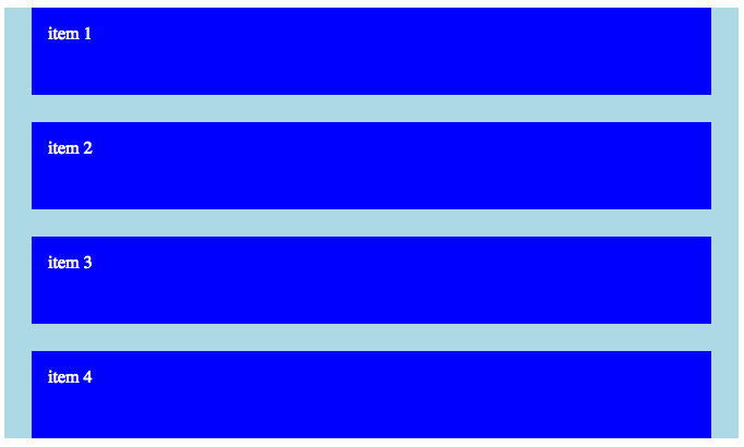
Here’s what we have so far, without Flexbox styling yet.
Step 2
Now, just add display: flex; inside the container styling and watch happens automatically.
.container {
  background:lightBlue;
  max-width:960px;

  /*FLEXBOX*/
  display:flex;
}

Step 3
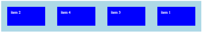
Changing the Order
The first cool thing we can do with Flexbox is change the order of the child containers. Just add the following property to the parent container.
/* ORDER */
flex-direction:row-reverse;

What if we want to specifically target one child container and change its order? It’s as easy targeting and including the following CSS property. This way you can have complete control in which order the child containers appear in.
.content:nth-child(1) {
  order:4;
}

.content:nth-child(4) {
  order:2;
}

.content:nth-child(3) {
  order:3;
}

.content:nth-child(2) {
  order:1;
}

Flex Grow
As cool as the boxes look all shifted to the right, lets evenly distribute them across the row. As you resize the container, the boxes will responsively resize.
Include the following CSS property in the child container class.
flex-grow:1
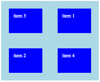
Flex Wrap
You might be asking yourself, what happens in a responsive situation? By default, the child containers will automatically resizes themselves on the same row getting very narrow instead of dropping down to the next row. Here’s how we change that.
Add the following CSS property to the parent container in order for the child containers to drop down automatically to the next row as parent container gets smaller.
flex-wrap: wrap;
To get an even deeper look into how Flexbox works, check out this complete guide on CSS-Tricks.